White Space in Your Resume: Best Practices & Examples

Using white space on your resume can significantly improve its appeal and readability. It is, essentially, the key to accentuating the content of your resume. Both design aspects and text can only stand out and catch the recruiter’s eye if there is enough space for them to do so. So, to create a polished and organized resume, it’s vital to use the white space on your resume effectively.
Table of contents
What is a white space in resume?
White space, often also referred to as negative space, is a section of your resume that remains empty to create space between paragraphs. The design principle of white space builds on the fact that an absence of content will draw your eye to the text. In a literal sense, white space refers to the amount of space left between paragraphs and words. If your text creates solid blocks of grey writing, the reader will feel overwhelmed. So instead, you should use white space to help you create a text that’s easy to read and looks inviting.
Tip: Your resume should never be one huge block of text. After all, you’re not writing a book. Dark, seemingly never-ending text clutters are nightmare material for hiring managers and recruiters.
Read more: The 6 rules of effective resume design
Best practices for using white space in your resume
You should use white space to make your resume look organized and neat. That way, the recruiter does not have to search for each section on a cluttered, cramped A4 page. Leaving white space between the sections highlights the main focus points of your resume. This can, in turn, increase the reader’s comprehension by as much as 20%, as research shows that focusing on comprehending effectively spaced text is much easier.
To effectively use white space in your resume, you can follow these guidelines:
1. Balance and proportion
Maintain a balanced distribution of white space throughout your resume. Avoid overcrowding the page with too much text or excessive design elements. Instead, create a visually pleasing layout by giving each section and element enough breathing room.
2. Paragraph and line spacing
Properly space out paragraphs to make them more readable. Consider adding a bit of extra space between paragraphs, rather than having them tightly packed together. This helps create a clear visual distinction between different paragraphs and improves overall readability.
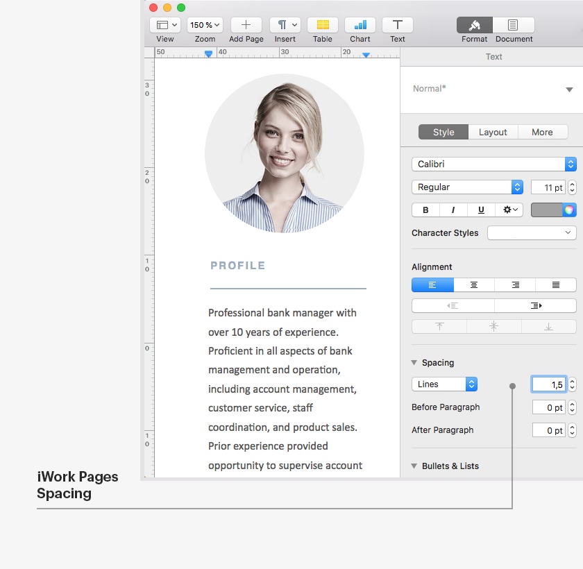
Adjust the amount of space between each line of text using the line spacing feature in word processing software like Microsoft Word or Apple Pages. It’s recommended to use a line spacing of 1.0 or 1.15 within bullet points and body text (single-spaced).


3. Margins and padding
Set appropriate margins and padding around the content of your resume. This helps frame the information and ensures that it doesn’t feel cramped. Generally, the top and bottom margins of the page should be no more than 0.5 inches, and the side margins should be no less than 0.75 inches. This will ensure you have enough room to set your page for single-spaced or 1.5-point line spacing, keeping your text united and balanced. Adequate margins and padding allow the eyes to move smoothly across the page, making it easier to read and comprehend.
4. Section separation
Use white space to separate different sections of your resume. This can be achieved by placing sufficient space between headings, subheadings, and body text. Clearly defined sections enhance readability and make it easier for the reader to navigate through your resume.
5. Bullet points and lists
When using bullet points or lists to present information, leave enough white space between each item.When presenting your achievements or skills on your resume, using short bullet points that are no longer than one line is an effective strategy for conciseness and readability. If you prefer to avoid bullet points, you can also group your experience into short text blocks. However, it’s important to ensure that each block is not longer than six lines.
6. Use of columns
If you’re using a multi-column layout, ensure there is sufficient white space between the columns. This helps maintain readability and prevents the content from feeling cluttered or overwhelming.
Examples
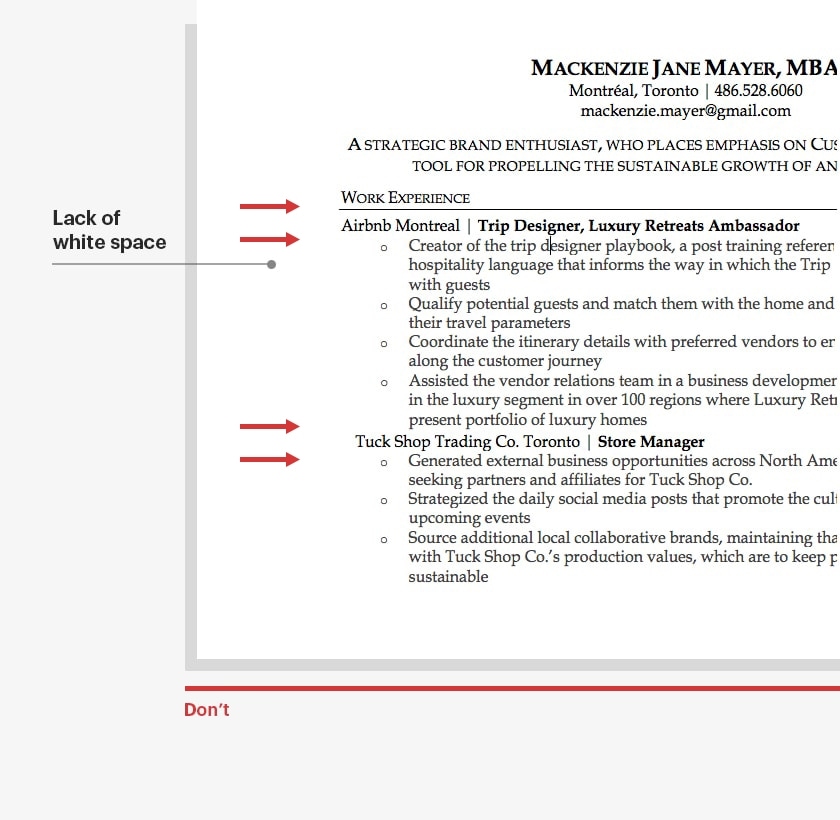
Example of poor use of white space:

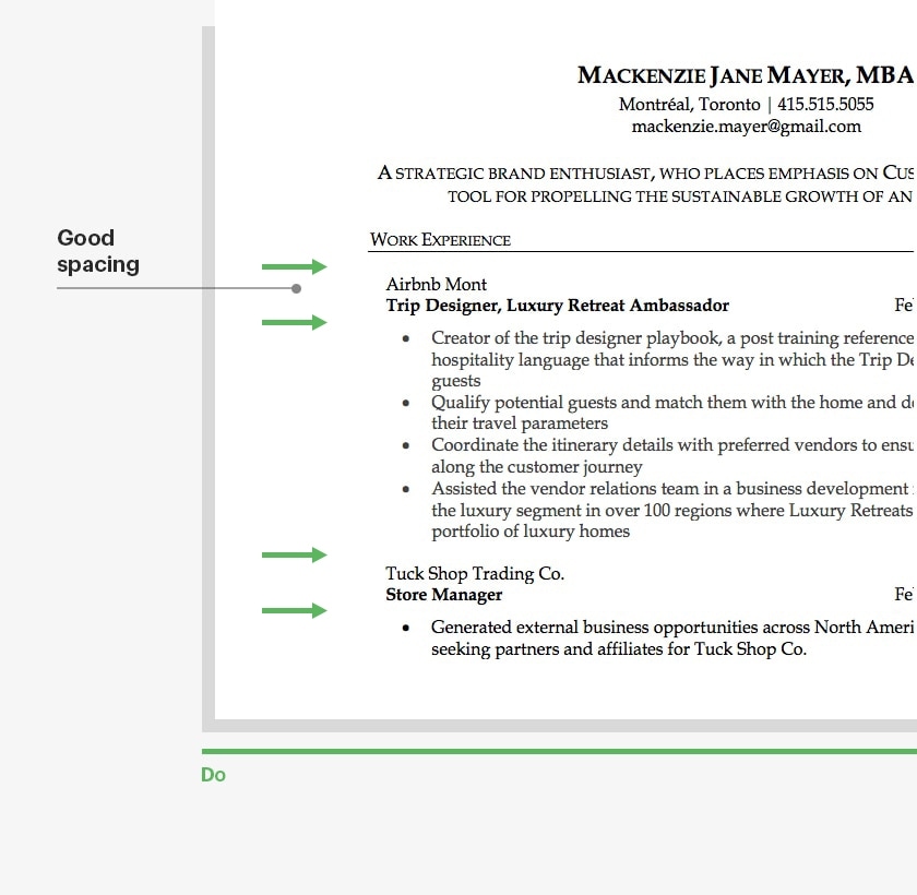
Example of good use of white space:

Effectively using white space on your resume can improve its appeal, readability, and chances of getting noticed by a hiring manager. It’s important to strike a balance between white space and text to create a polished and organized resume that stands out to recruiters.
White Space in a Resume FAQ
Why is white space important in a resume?
White space is important because it makes your resume easier to read, creates a professional appearance, and helps key information stand out. It also prevents the document from looking cluttered or overwhelming to recruiters.
How does white space affect readability?
White space improves readability by breaking up large blocks of text, guiding the reader’s eye through the resume, and making it easier for recruiters to quickly scan and find important information.
How can I use white space to highlight important information?
You can strategically use white space to draw attention to key sections or details, such as your name, contact information, job titles, or significant achievements. Adding space around these elements makes them stand out more.
What common mistakes should I avoid with white space in my resume?
Avoid using too little white space, which can make your resume look cluttered, and too much, which can make it seem sparse. Also, ensure that the space is used consistently throughout the document to maintain a professional appearance.
You may also be interested in:
- How to Make a Resume in 2026: [+How-to Guide]
- Hard Skills For Your Resume [In 2026]
- Resume Objective Examples for 2026 [+How-to Guide]
- 41 Resume Tips to Make Your Job Application Stand Out
- Strengths and Weaknesses for Job Interviews in 2026 [Best Answers]
- How to Answer “What Are Your Salary Expectations?” [2026]

 Privacy Protected