
10 Best Resume Fonts for 2025 [Stand Out & Get Hired]

Choosing the best fonts for your resume can be tricky. When you’re creating your resume, there’s a lot to keep in mind. Between writing the content of your resume and choosing from an endless selection of designs, it’s easy to overlook some of the fundamental aspects. But if there’s one thing you don’t want to neglect, it’s choosing the best font for your resume.
Top 10 fonts for your resume
Below are 10 of the top fonts for your resume, renowned for their professionalism, readability, and wide compatibility across different systems.
| 1. Calibri | 6. Verdana |
| 2. Garamond | 7. Times New Roman |
| 3. Helvetica | 8. Corbel |
| 4. Arial | 9. Georgia |
| 5. Didot | 10. Tahoma |
1. Calibri
It is a modern font with excellent legibility and Word’s standard font. It performs exceptionally well on computer screens. Moreover, its design ensures legibility even if you choose a smaller resume font size.

2. Garamond
If you are looking for a more modern version of the standard Times New Roman, Garamond is perfect. This font will give your resume a polished and neat look. Furthermore, Garamond can help you tighten up the space of your resume. It can do this without sacrificing the readability by decreasing the letter spacing.

3. Helvetica
Like Arial, Helvetica offers clean lines and outstanding legibility. This font is so popular that some of the world’s biggest brands, such as BMW or Microsoft, have used it in their logos. Its professional appearance makes Helvetica a safe bet for your resume font.

4. Arial
Arial is a sans-serif font that is legible and simplistic. It is a safe choice as a font for a resume, and it remains a classic among many job seekers. It is often considered the simpler version of the famous Times New Roman.

5. Didot
Didot looks very elegant thanks to the straightforward, rational design and fine strokes. It’s known to draw the readers’ attention due to its ‘dazzle’ effect and thick verticals.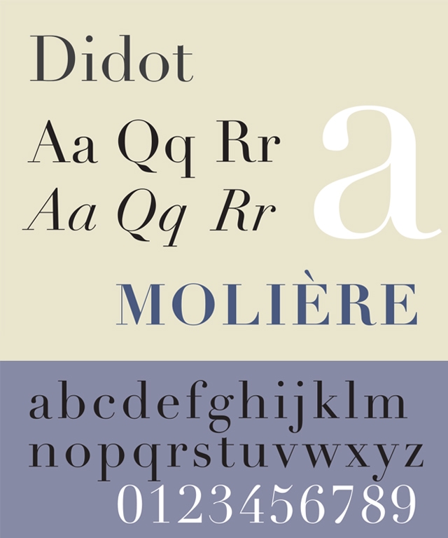
6. Verdana
Verdana was designed for maximum legibility, with wide spacing that ensures clarity even at smaller sizes. While it’s similar to Tahoma in its legibility, its more open letter spacing gives it a distinct look.
.
7. Times New Roman
Times New Roman remains one of the most used fonts. Yet, its timeless look has its shortcomings. Because of its popularity, a resume with Times New Roman may not stand out as well. Moreover, if you choose a smaller resume font size, Times New Roman may be hard to read. This font thus remains a timeless classic and will not harm you, but it might not make your resume stand out.

8. Corbel
This font is a more creative design than the standard Calibri. Corbel can make your resume look unique and modern. Released in 2005, Corbel is perfect for those looking for a legible yet creative font for a resume.
.
9. Georgia
A classic serif font designed for elegance and readability. It features strong, well-defined letterforms that enhance professionalism, making it ideal for corporate, legal, and academic resumes. Its balanced spacing and timeless design ensure excellent legibility both on-screen and in print.

10. Tahoma
Tahoma is a modern sans-serif font known for its clean, straightforward design. Its tight letter spacing makes it a great option for fitting more content onto a resume without compromising readability.

11. Roboto
A modern sans-serif font designed for clarity and versatility. It offers a neutral and professional look, making it perfect for resumes in tech and digital fields. Its clean lines ensure excellent legibility both on-screen and in print.

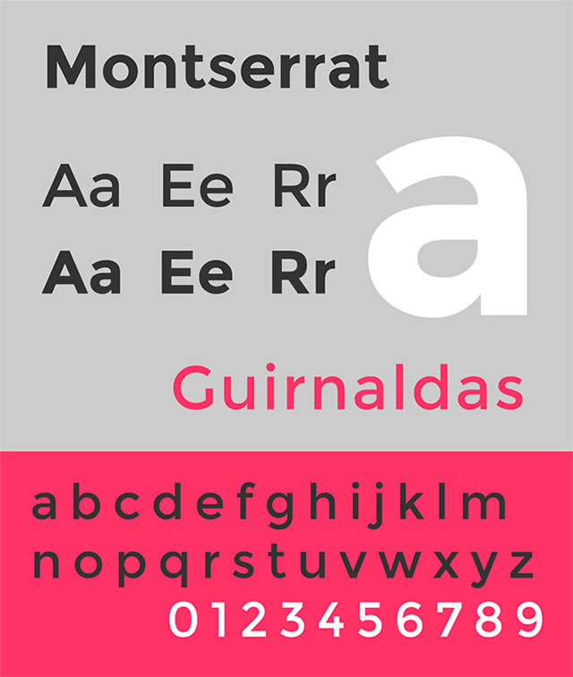
12. Montserrat
A bold, contemporary sans-serif font with a distinctive geometric style. Its modern, strong appearance makes it an excellent choice for resumes that want to stand out while still maintaining a professional tone, especially in design and startup industries.
How to choose the best fonts for your resume?
When choosing the right font size for your resume, it’s important to consider readability and legibility. You want to ensure that your resume is easy to read and that the font size is appropriate for both paper and digital formats. Here are some guidelines to help you choose the right font size for your resume:
Considerations for Font Size Selection:
- Standard Font Size: The standard font size for a resume is typically between 10 and 12 points. This size ensures that the text is legible and doesn’t appear too small or too large on the page.
- Consistency: Maintain consistency in font size throughout your resume. Use the same font size for all sections, including headings, subheadings, and body text, to create a cohesive and professional look.
- Readability: Ensure that the font size you choose allows for easy reading. Avoid using font sizes that are too small, as they can strain the reader’s eyes. Similarly, avoid using font sizes that are too large, as they can make your resume appear unprofessional and take up unnecessary space.
Recommended Font Sizes:
- Headings: For section headings, such as “Work Experience” or “Education,” a font size between 14 and 16 points can be used to make them stand out.
- Subheadings: For subheadings within sections, a font size between 12 and 14 points can be used to differentiate them from the body text.
- Body Text: For the main body of your resume, including job descriptions and bullet points, a font size between 10 and 12 points is generally appropriate. This size ensures readability while maximizing the use of space.
Choosing the perfect resume font for your industry and role
Here are tips on how to choose the best resume font based on your industry, job role, and level of experience.
Corporate & Traditional Industries (Finance, Law, Consulting, Government)
Why? These fonts convey professionalism, tradition, and reliability—key traits valued in conservative industries.
Tip: Stick to classic serif or sans-serif fonts and avoid overly modern or artistic typefaces.
Creative & Design-Oriented Fields (Marketing, Graphic Design, Fashion)
Why? These fonts balance creativity and professionalism, making your resume visually appealing while maintaining readability.
Tip: A touch of typography flair can work, but don’t overdo it—stick to a clean and modern look.
Tech & Startups (Software Engineering, Data Science, UI/UX, IT)
Why? These fonts are modern, clean, and widely used in digital environments, aligning with the innovation-driven culture of tech.
Tip: Opt for a sleek sans-serif font that looks great both on-screen and in print.
Academic & Research Positions (Education, Science, Nonprofits)
Why? These fonts are elegant, scholarly, and readable, reflecting the analytical nature of academia.
Tip: A serif font can add credibility and make lengthy documents easier to read.
Entry-Level & Recent Graduates
Why? These fonts are clean and modern, ensuring your resume is easy to read for recruiters scanning multiple applications.
Tip: Keep it simple—avoid script or decorative fonts that might make your resume harder to scan.
Senior Executives & Leadership Roles
Why? Senior professionals need a font that exudes confidence, authority, and sophistication.
Tip: A refined serif or a high-end sans-serif font helps establish leadership presence.
Fonts to avoid on resumes
Certain fonts can make your resume appear unprofessional or outdated. Avoid using overly casual or hard-to-read fonts like Comic Sans, Papyrus or Courier. These fonts may give the impression that you’re not serious or detail-oriented, which can hurt your chances with potential employers. Stick to clean, modern fonts that ensure your resume is taken seriously.
Conclusion
Your choice of the best fonts for your resume plays a crucial role. You should aim for a professional, distinctive, and elegant look. Consider this when deciding on the font for your resume. The look of your resume may make the difference between an interview and rejection.
FAQ
What is the best font to use on a resume?
The best fonts for resumes are typically clean, professional, and easy to read. Popular choices include Arial, Calibri, Helvetica, and Times New Roman.
Should I use a different font for headings and body text on my resume?
You can use a different font for headings to create contrast, but many professionals prefer sticking to one consistent font throughout for a clean and cohesive look.
Can I use downloaded or custom fonts on my resume?
It’s safer to use standard fonts that are widely available, as custom or downloaded fonts may not display correctly on different devices or systems.
Does font choice vary by industry?
Yes, font choice can vary by industry. For example, more creative industries might allow for slightly more modern or unique fonts, while traditional industries like finance or law may prefer classic, conservative fonts.
Popular related posts:
- 18 High-Income Skills to Learn in 2025
- 35+ Strengths To List on Your Resume (With Examples)
- How to Research a Company for an Interview: A 10-Step Guide
- 10 Transferable Skills Employers Are Looking for in 2025
- 20+ Resume Summary Examples for 2025 [+How-to Guide]
 Privacy Protected
Get a Free Expert Resume Review
file here or click to upload
Thank You